Figure & Table Quality
Figures and tables serve various roles throughout your reports. They can show critical data when it would be impractical to describe it, lay out a particularly complicated workflow so that readers can better understand it, or show data in a less biased way so that readers can come to their own conclusions. In general, the reader should be able to go through a section and then see a figure regarding its main point. This is most often important in results and conclusions sections but can be helpful in methods and introduction as well.
Captions are necessary for each figure. They should succintely provide enough detail so that the reader can understand the figure. Ideally this should be enough so that readers could understand the figure without reading the main body of the text.
If you are not sure if a figure or table should be included simply consider this: Is this critical to a thorough reading of this report? If you find that a figure is an edge case, or would only be useful to those looking for additional information, feel free to include it as a supplemental figure.
Important Features
- Relates directly to text
- Contains necessary information
- Does not contain too much unnecessary information
- Fully labeled and unambiguous
- Clear and succinct captions
- Visually pleasing
Common mistakes
- Extraneous and unexpected information
- Not providing support for claims made in the results or discussion sections
- Unclear or missing labeling
- Use of methodology not explained in the methods section
- Poor choice of color scheme
- Information obscured by legends or other information
- Unreadable text
Examples
Unlabeled axes and a bit too much detail in the caption:
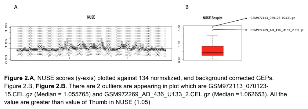
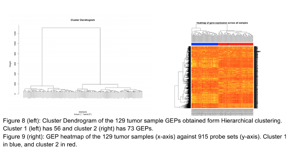
Text shrunk to the point of being unreadable. The gene names (right y axis of the right image) could have been cut and replaced with a simpler, general axis title. There is no legend to indicate what color is high in the heatmap:
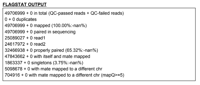
If something looks like this, put it in a table:
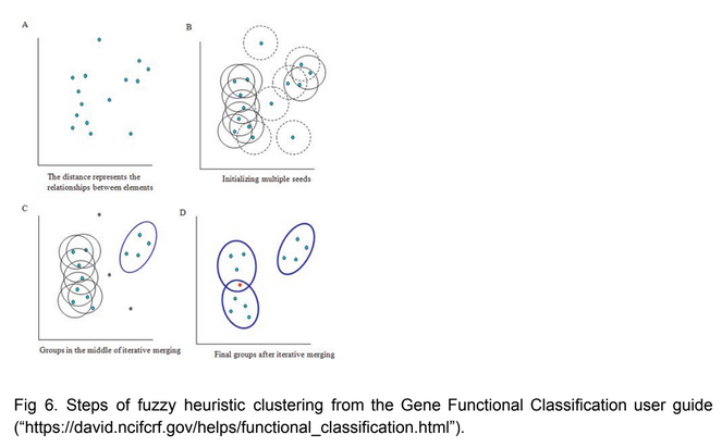
Good use of a figure to explain a method central to the report. More detail or formatting besides the cut and paste would be welcome though:
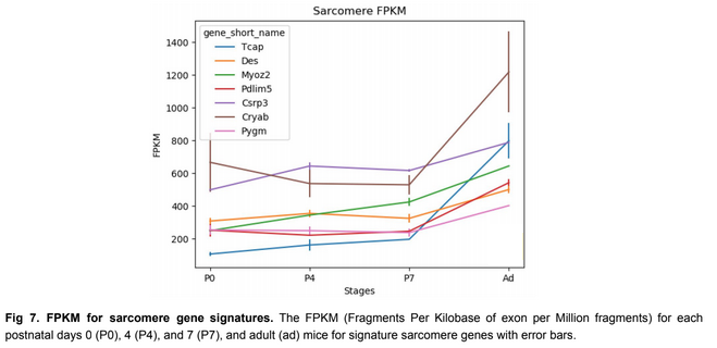
Clear use of extra time to make every inch of the figure useful: